

How to turn off Liquid Glass on iPhone (or tone it down)
Liquid Glass makes menus, notifications and the Control Center see-through. If that makes text hard to read, you cannot remove it completely, but you can get very close. Here is every setting that helps.
Photo by Drew Coffman on Unsplash
Liquid Glass is the see-through design Apple introduced with iOS 26. Tab bars, notifications, Control Center and folders let the content behind them show through, a bit like frosted glass. Some people love it. Many others find white text on a busy wallpaper hard to read, especially in sunlight or with less than perfect eyesight.
There is no single off switch. Apple treats Liquid Glass as the look of the whole system, not an optional effect. What you can do is combine a few settings until menus are solid, text has strong contrast and very little moves around. The steps below get you there, starting with the one that makes the biggest difference.
Step 1: Turn on Reduce Transparency (works on every version)
This is the closest thing to an off switch, and it works on both iOS 26 and iOS 27. It replaces the see-through layers with solid backgrounds almost everywhere.
- 1
Open Settings and tap Accessibility.
- 2
Tap Display & Text Size.
- 3
Turn on Reduce Transparency.
The full path is Settings › Accessibility › Display & Text Size › Reduce Transparency. The change is instant. Swipe down for Control Center to see the difference: the panels are now solid gray instead of showing your wallpaper through them.
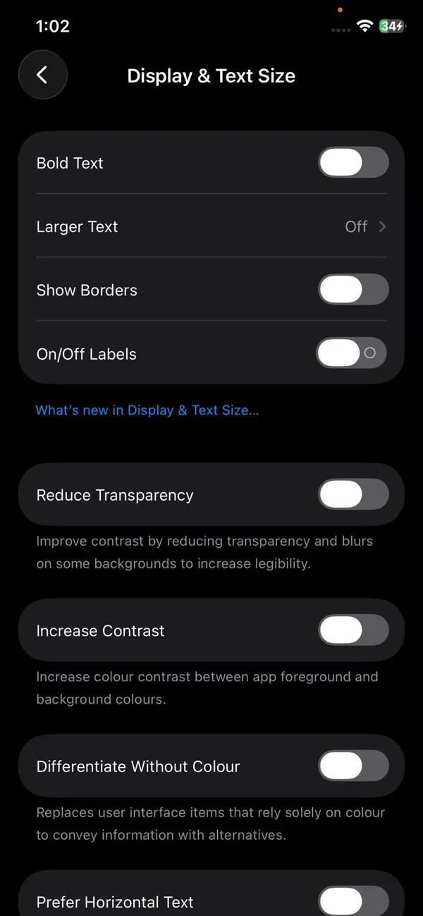
Some apps draw their own glass effects, so you may still see a little transparency in places. For the system itself, including notifications, the Dock, folders and Control Center, this setting does most of the work.
Step 2: How to turn off Liquid Glass with the iOS 27 slider
iOS 27 added a new Appearance section to Settings. It gathers display style options in one place and includes a Liquid Glass slider that controls how clear or tinted the glass is across the system.
- 1
Open Settings and tap Appearance.
- 2
Tap Liquid Glass.
- 3
Drag the slider all the way to the right.
Left makes the glass clearer and more transparent. Right adds tint and makes it more opaque. The default sits in the middle. The preview at the top updates as you drag, so you can stop wherever text is comfortable to read.
The slider on its own leaves a hint of the glass look, which some people like. If you want menus fully solid, keep Reduce Transparency from Step 1 turned on as well. The two settings work together.
On iOS 26: choose Tinted instead
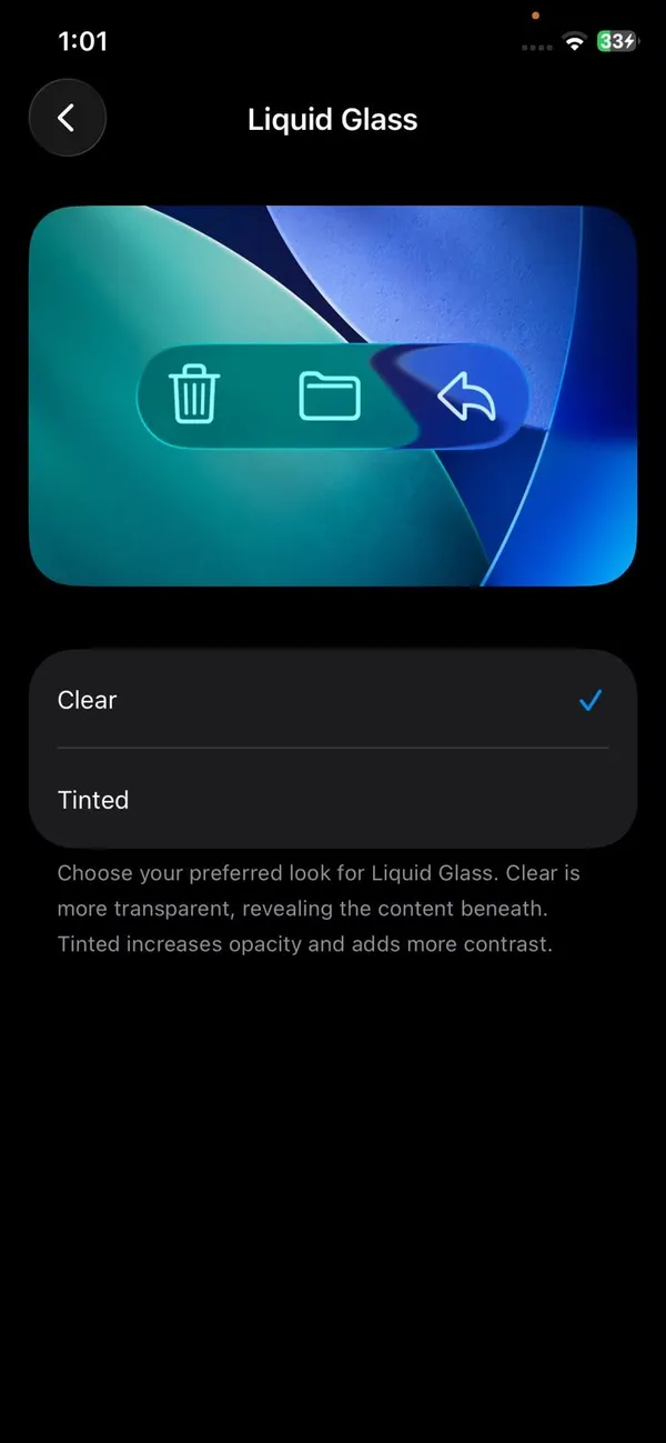
iOS 26.1 and later versions of iOS 26 have a simpler two-option switch. Go to Settings › Display & Brightness › Liquid Glass and choose Tinted instead of Clear. Tinted adds opacity and contrast to buttons, tab bars and notifications. If you do not see this option, you are on iOS 26.0, so install the latest update from Software Update first.
Step 3: Turn on Increase Contrast
Reduce Transparency fixes the see-through backgrounds. Increase Contrast fixes the second common complaint: buttons and text that blend into what is behind them. It adds darker edges and stronger colors so controls stand out.
Turn on Settings › Accessibility › Display & Text Size › Increase Contrast. While you are on that screen, Bold Text and Button Shapes are worth trying too. Bold Text is the single best readability boost for most people, and Button Shapes puts clear outlines around tappable text.
Step 4: Make app icons solid again
iOS 26 also gave app icons Clear and Tinted styles. If your icons look washed out or hard to tell apart, one of these styles may be switched on.
- 1
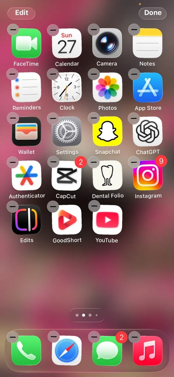
Touch and hold an empty spot on the Home Screen until the icons jiggle.
- 2
Tap Edit in the top corner, then tap Customize.
- 3
Choose Default.
Default gives you the normal colored icons. Dark keeps colors but darkens the background, which many people find easier on the eyes at night. Clear and Tinted are the most glass-like styles, so avoid them if you want less of the effect.
- 4
Tap outside the panel to save.
Step 5: Make the Lock Screen clock and notifications solid
Starting with iOS 26.2, the Lock Screen clock can be glass or solid. To change it, touch and hold the Lock Screen, tap Customize, choose the Lock Screen, tap the clock and pick the Solid style instead of Glass. Tap Done.
Notifications on the Lock Screen follow the Reduce Transparency and Liquid Glass settings above. A plainer wallpaper also helps a lot. Busy photos behind see-through notifications are the main reason people cannot read them. Our guide to changing your iPhone wallpaper shows how to switch to a solid color or a darker photo.
Step 6: Cut down the motion effects
Liquid Glass is not only transparent, it also moves. Buttons shimmer and stretch as you touch them, and highlights shift when you tilt the phone. If that feels distracting or makes you a bit queasy, turn on Settings › Accessibility › Motion › Reduce Motion.
Reduce Motion swaps zoom animations for simple fades and tones down the parallax effect on your wallpaper. It does not make the phone slower. Many people find it feels faster, because screens appear without the extra animation.
Does Liquid Glass drain your battery?
This is one of the most searched questions about the new design, so here is a straight answer. Apple has not published any figures showing that Liquid Glass shortens battery life, and we have not seen reliable test results that show a meaningful difference either way. Drawing blurred, see-through layers does take some graphics work, so Reduce Transparency may save a tiny amount. Do not expect extra hours.
Battery complaints right after a big update usually have another cause. Your iPhone spends a few days re-indexing photos and files after an update, which uses more power until it finishes. If battery life is still poor after a week, see our guide to an iPhone battery that drains fast, and check what Low Power Mode actually changes.
The best settings combination for readability
If you just want the clearest, most solid screen without testing each setting, turn on this set. It takes about two minutes:
- Reduce Transparency: on
- Liquid Glass slider (iOS 27): far right, or Tinted on iOS 26
- Increase Contrast: on
- Bold Text: on
- App icon style: Default or Dark
- Lock Screen clock: Solid
- Reduce Motion: on, if the animations bother you
None of these settings delete anything or change how apps work. You can switch any of them back at any time, so it is safe to experiment.
On iPad and Mac
The same design arrived on iPad and Mac, and the same main fix applies. On an iPad, turn on Settings › Accessibility › Display & Text Size › Reduce Transparency, then look for the Liquid Glass setting under Appearance or Display & Brightness, depending on your iPadOS version. On a Mac, open System Settings › Accessibility › Display and turn on Reduce transparency. The menu bar, Dock and sidebars then become solid. Menu names can differ slightly between versions, so use the search field in Settings if you cannot find an option.
Why can't Apple just add an off switch?
Liquid Glass is not a filter laid over the old design. The layout itself changed: tab bars float above content, controls sit in rounded capsules, and menus grow out of the button you tapped. Removing the glass would not bring back the flat iOS 18 layout, because that layout no longer exists in the system.
That is why Apple's answer has been more control rather than an off switch. The Tinted option arrived in iOS 26.1, the solid clock in 26.2 and the slider in iOS 27. If Apple adds more, we will update this guide.
Frequently asked questions
Can you completely turn off Liquid Glass?
No. Liquid Glass is the design of iOS 26 and later, so the rounded shapes and floating bars stay. Turning on Reduce Transparency removes almost all of the see-through effect, which is as close to off as Apple allows.
Does turning off Liquid Glass save battery?
Apple has not published any numbers, and the effect on battery is likely small. If battery life is your worry, Low Power Mode and screen brightness matter far more than transparency.
Where did the Liquid Glass Clear and Tinted setting go?
In iOS 27 it moved from Display & Brightness to a new Appearance section in Settings and became a slider. On iOS 26.1 and 26.x it is still a Clear or Tinted choice under Display & Brightness.
Can I go back to the iOS 18 look?
Not on the same iPhone without erasing it, and Apple usually stops allowing downgrades within weeks of a release. The settings in this guide are the practical way to get a flatter, more solid look.
What to try next
Related guides
Clean a SIM card on iPhone
Clean an iPhone SIM card and tray safely with a dry lint free cloth. Learn what to avoid, how to test the SIM, and when to replace it if you see No SIM.
Move iCloud backup to Google Drive
You cannot move a full iPhone backup from iCloud to Google Drive, but you can move photos, files, contacts and calendar. See each method and what to expect.
Find APN settings on iPhone
Find APN settings on your iPhone in Settings › Cellular › Cellular Data Network. Learn why the menu can be missing, what each field means and how to reset it.
How to tell if an iPhone is fake
Check if an iPhone is genuine before you buy. Use the serial number on Apple's Check Coverage page, match the IMEI, and review Parts and Service History.
More guides you may need
Use your phone in Canada
How to use your phone in Canada without surprise charges. Check if your US plan includes Canada, set up roaming and avoid border tower traps.
Send a voice message on iPhone
Send a voice message on iPhone from the plus menu in Messages, review it before sending, and stop audio messages from disappearing after 2 minutes.